Default Dashboards in Analytics
Default Dashboards in Analytics along with a range of ‘drill-down’ pages.
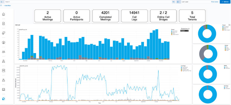
Drill-down (click on “completed meetings” in the Completed Meetings metric) into what meetings have taken place:
The blue bars indicate a call; if you need to reduce the volume of calls displayed, use the slider to select the “top n” meetings. Drill down into any of the calls to see more details.
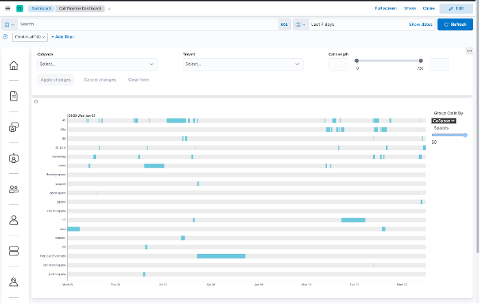
Click on one of the meeting blue bars to see:
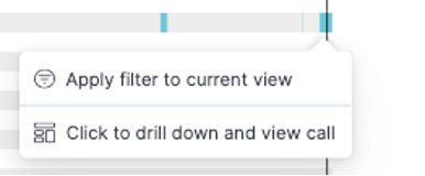
Click on “Click to drill down and view call”:
The time-line visualization has a left boundary of when the call started and the right one indicates when it ended. A blue bar represents each participant. If a participant joins multiple times, you’ll see multiple bars. You can clearly then see when people joined, left or re-joined. The color indicates the level of call performance they experienced (pale blue good; darker blue, more packet loss):
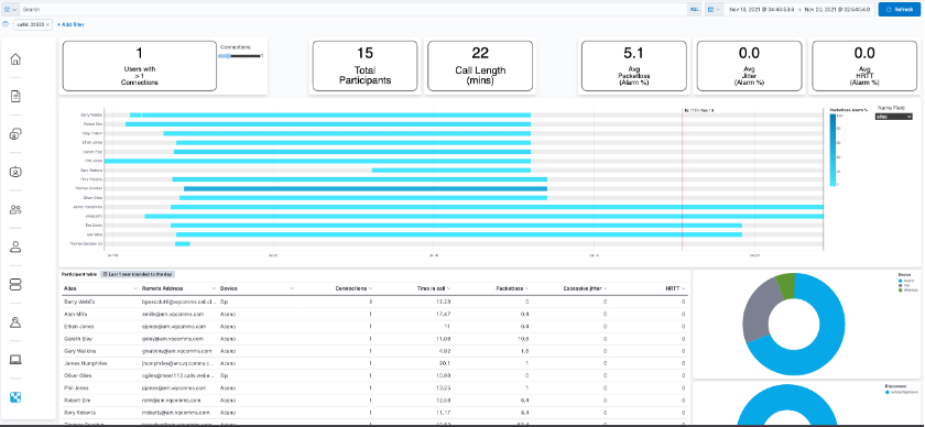
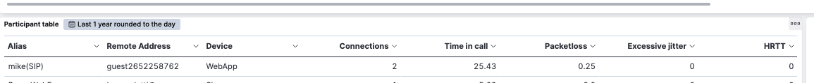
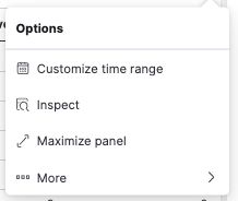
To download a CSV of all participants, click on the 3 dots in the top right corner of the Participants Table visualization:
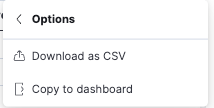
Click on More:
And then Download as CSV:
For customers with the Enterprise Elastic license, pdfs of dashboards can be exported via Menu ->Share:
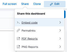
Click on PDF Reports:
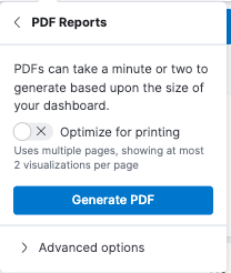
Click on Generate PDF and wait about 45 seconds for the pdf to be generated. The pdf can be downloaded from the toaster pop-up or the Kibana Navigation panel on the left (Management ->Stack Management ->Alerts and Insights ->Reporting)
NOTE: We have two known issues also listed under “Known Errors”
-
Do not select optimize for printing with the new Vega based dashboards; each of the components is displayed on a separate page
-
Using Chrome, a “this page is blocked” message will be displayed when you try to download the pdf. A simple work-around is described in the Known Issues section
In addition to the new dashboards and visualizations, a navigation panel on the left hand-side is available for direct access to each of the new dashboards. There’s also a Home button to get you back to the Dashboard home. Also note the documentation icon (second from top). At the bottom, there’s a link to the legacy dashboards.
The new dashboards are written as Vega visualizations. These are advanced and we’re not suggesting customers build their own. Customers wanting to create their own visualizations are recommended to use Kibana’s in-built “Lens” visualization tool. We’ve provided a navigation icon that will enable customers to create new dashboards and link them in. As customers get more advanced in their requirements, we’ll work with them to implement the requirement in Vega.
Please contact support@vqcomms.com for details on how to use Lens, link new Dashboards into the navigation panel or help on how to use Kibana.
Using the new dashboards with existing Kibana/Elasticsearch data
The new dashboards required changes to the underlying data in Elasticsearch. You will therefore notice that the new dashboards do not show data from before the VQCM 3.9 release. We took the decision not to automatically update the data within the upgrade process; the upgrade process is already complex and we did not want to introduce additional complexity and risk. For that reason, the data migration process takes place outside the upgrade process.
Please contact support@vqcomms.com who will take you through the process; its automated and quick.